

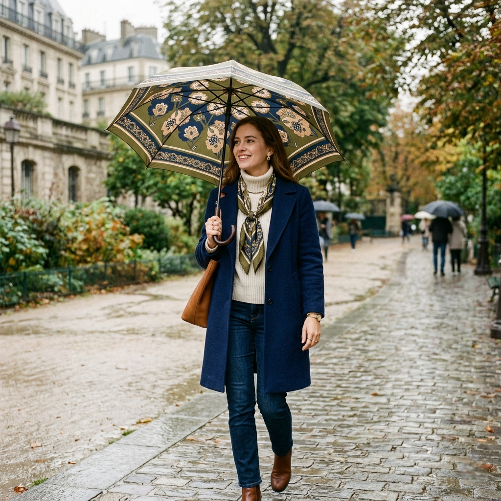
I never thought of an umbrella as part of what I was wearing.
It was always separate. Something practical I grabbed on the way out, usually without looking. Black, most of the time. Safe, invisible, reliable. It did its job, and that was enough.
Until one afternoon, when it didn’t feel like enough.
I was dressed more intentionally than usual—nothing formal, just balanced. Layers that worked together, colors that felt considered. Then it started raining. I opened my umbrella, glanced down, and for the first time, it felt disconnected.

Not wrong, exactly. Just… unrelated.
That small disconnect stayed with me longer than I expected.
After that, I started noticing umbrellas differently. Not as objects you carry, but as something that enters your visual space the moment it opens. It sits above you, framing everything else. And suddenly, it matters more than you think.
The first change I made wasn’t dramatic.
I just stopped defaulting to black.
Not because black doesn’t work—it does, almost always. But it also disappears. It doesn’t add anything to what you’re wearing. It stays neutral, which is useful, but also limiting.
I wanted to see what happened when it didn’t disappear.
So I tried something slightly different. A deep navy umbrella. Still subtle, still restrained, but with just enough variation to feel intentional. The effect was quiet, but noticeable.
It didn’t clash with anything.
But it also didn’t feel detached.
That’s when I realized coordinating an umbrella isn’t about matching colors directly. It’s about creating a relationship between what you’re wearing and what you’re holding.
And that relationship can be subtle.
At first, I thought coordination meant repetition. If I was wearing something warm—browns, earthy tones—then the umbrella should reflect that. If my outfit leaned cooler, then the umbrella should follow.
It made sense in theory.
But in practice, it felt too literal.
The outfit started to look like it was trying too hard to connect everything. Like each piece was echoing the other instead of contributing something of its own. It lost depth.
That’s when I started thinking in terms of tone instead of color.
Warm and cool. Light and dark. Muted and saturated.
These things matter more than exact shades.
A muted olive coat, for example, doesn’t need a green umbrella. But it pairs naturally with something equally subdued—deep brown, charcoal, even a soft navy. The connection isn’t obvious, but it’s there.
And that’s enough.
I also noticed how the umbrella changes the balance of an outfit.

When it’s closed, it’s just another object. But when it opens, it becomes the largest visual element you’re carrying. It creates a kind of frame around you. And if that frame feels disconnected, it’s hard not to notice.
That doesn’t mean it needs to dominate.
In fact, the best combinations I’ve found are the ones where the umbrella supports the outfit without taking over. It adds to the overall impression without becoming the focus.
That balance is delicate.
Patterns made this even more interesting.
I used to avoid them completely. They felt too specific, too limiting. But then I tried a subtle pattern—something understated, not immediately visible from a distance. And it changed how I saw things.
Patterns don’t need to match your clothing.
They just need to feel compatible.
If your outfit is already detailed, a busy umbrella can feel overwhelming. But if everything you’re wearing is minimal, a slight pattern can introduce just enough variation to keep things from feeling flat.
It’s less about coordination and more about contrast.
Texture plays a role too, though it’s harder to define.
Some umbrellas have a matte finish, absorbing light instead of reflecting it. Others feel smoother, slightly reflective, more structured in appearance. These differences affect how the color is perceived.

A matte black feels softer than a glossy one.
A deep color in a textured fabric feels more grounded than the same color in a smooth finish. These are small distinctions, but they shape the overall impression.
And once you notice them, they become hard to ignore.
Of course, not every attempt works.
I’ve carried umbrellas that looked interesting on their own but didn’t connect with anything else. Colors that felt slightly off—not wrong enough to stand out, but enough to create tension.
Those moments taught me something important.
Coordination isn’t about perfection.
It’s about reducing friction.
If something feels slightly out of place, even if you can’t explain why, it’s worth paying attention to. Because those small mismatches accumulate. They don’t ruin an outfit, but they prevent it from feeling complete.
And sometimes, the fix is simple.
Choosing something quieter. Or slightly warmer. Or just less defined.
What surprised me most is how this changed my relationship with everyday objects.
I started seeing them as part of a larger composition. Not separate, not purely functional, but integrated. The umbrella became an extension of what I was wearing, even if only for a moment.
That shift made me more intentional.
Not in a rigid way, but in a quieter one.
I stopped asking, “Does this match?” and started asking, “Does this belong?”
That question is harder to answer, but more useful.
Because when something belongs, you don’t have to think about it. It fits naturally into the whole. It doesn’t draw attention to itself, but it also doesn’t disappear completely.

It just works.
So if you’re trying to coordinate your umbrella with your wardrobe, I wouldn’t focus on exact colors.
I’d focus on feeling.
Look at your outfit as a whole. Notice the tones, the balance, the level of contrast. Then choose an umbrella that supports that, not one that tries to mirror it.
Because in the end, the goal isn’t to make everything match.
It’s to make everything feel connected, even in small, almost unnoticeable ways.
And sometimes, that connection is what turns something ordinary—like an umbrella—into part of your style.



Share:
The Quiet Emotion Behind a Thoughtful Luxury Gift
Best Umbrella for Your Style